")
Walking into Kate Spade’s office to preview its Fall 2026 collection feels like stepping into a Pinterest mood board that’s come to life.
A vibrant jade green backdrop sets the tone, layered with bags, swatches, and imagery, making it hard to know where to look. The first thing that caught my attention was a magenta tote on the far left, a color that continues to show up throughout the showroom, almost hinting at what’s ahead for fall.
Notably, in the center of the wall toward the top right sits the Sam bag. Known for its boxy shape and black nylon material, the Sam helped define Kate Spade’s early identity in the 1990s, quickly putting the brand on the map. The upcoming fall lineup seems to pull from that era with elements like animal prints, shearling textures, and bag charms. The purse silhouettes lean soft and curved, with rounded shapes and slightly slouchy structures that feel relaxed but still polished.
The duo bag display takes center stage in the main room. A breakout star from last year, the duo quickly gained traction, with celebrities like Lola Tung and Barbara Palvin already putting it into rotation. Set on bright magenta platforms, the duo display is fun and feminine. The soft pink bags are styled across varying heights, which keeps the setup dynamic, while the burgundy dress and fur jacket behind it add depth and a slightly moodier contrast.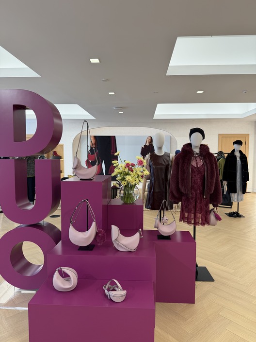
Photo Courtesy: Cassidy Colarik
Seeing it styled this way, it’s clear why it resonated. The duo isn’t tied to one specific look. It can be worn as a crossbody, shoulder bag, belt bag, or clutch, with or without the removable pouch. Additional versions come in new shades including animal print, metallic silver, and canary yellow.

Photo Courtesy: Cassidy Colarik
Bag charms are dotted throughout the room, showing up as small accents across different styles. Some lean playful, like furry animals, while others are more tied to New York, with mini pizza slices and yellow taxi cabs. The MetroCard charm also makes an appearance, coming back as part of a limited-edition restock after selling out last year. With MetroCards being phased out, it becomes a playful way to hold onto a piece of the city, turning something once swiped daily into more of a keepsake.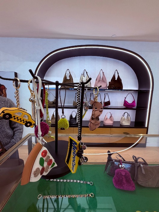
Photo Courtesy: Cassidy Colarik
A quieter focus on detail runs throughout the space. Subtle polka dot textures are worked into some of the bags, easy to miss at first glance. It adds dimension without overpowering the design, which feels in line with everything else, where small touches add a bit of a twist.
Overall, the collection doesn’t fully lean into the ’90s, but it still pulls from it in a way that just works. Familiar designs are reworked to stay modern without losing their roots.
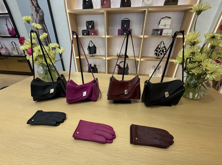
Photo Courtesy: Cassidy Colarik